UI Elements
Controls
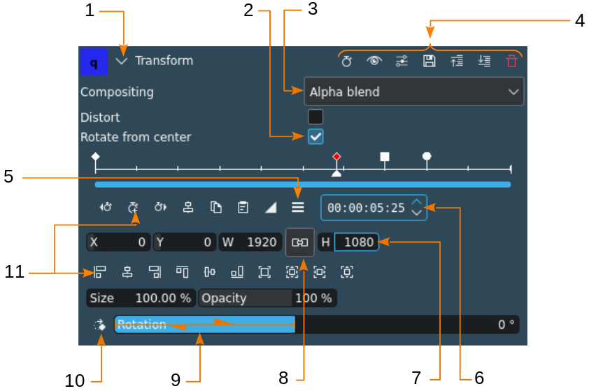
Kdenlive UI controls (example using the effect panel)
UI Element |
Description |
|---|---|
1 collapse/expand |
Collapses or expands a section of the user interface |
2 check box |
Used to select an optional element or feature |
3 drop-down list box |
Allows to select from a list of possible values |
4 toolbar icons |
Various action icons specific to the panel. See below for the icons. |
5 hamburger menu |
Opens a fly-out menu with more options |
6 spinner |
Used to increase or decrease a value one step at a time |
7 direct entry |
Used to enter a specific value. In most cases it is possible to use the Mouse wheel to increase or decrease the value. Hold Shift to increase by one (1), Ctrl to increase by 10. |
8 button |
Used to enable a certain state while it is pushed in. Click again to make it come out. |
9 slider |
Allows for rapid changes of values. Drag the mouse left or right to move the slider. The value in an adjacent direct entry field is changed accordingly. Hold Shift to increase by one (1), Ctrl to increase by 10. |
10 action button |
Used to change a value in defined steps. Every click changes the value, wrapping at the end of the scale may occur. |
11 action icon |
Used to execute an action that is not repeatable (with exceptions) |
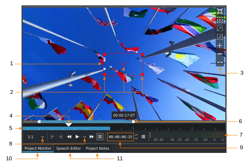
Kdenlive UI controls (example using the monitor panel)
UI Element |
Description |
|---|---|
1 edit frame |
[Project Monitor only] Identifies the object or area of the effect. Edit Mode needs to be enabled for the frame to show. |
2 edit frame handles |
Used to change the size (square handles) and move the frame (circle in the middle) |
3 monitor overlay |
Hover over the defined hot spot (default: top right-hand side) to reveal the list of icons |
4 playhead |
|
5 timeline zone |
Indicates the timeline zone set with I and O or by clicking |
6 zoom bar |
Used to zoom the timeline. Grab the white handles on either end and drag them left or right, or use Ctrl+MW while hovering over the monitor timeline. |
7 audio level meter |
Displays the audio level of the project or clip when playback is running. The audio mixer settings will change the audio level appearance. |
8 options drop-down |
Opens a list of options to select from |
9 timecode |
Shows the current position of the playhead in the notation hh:mm:ss:ff, where hh is hours, mm is minutes, ss is seconds and ff is frame. |
10 tab (active) |
Currently active widget |
11 tab (inactive) |
Available widgets in that section of the work layout |
 and
and  , respectively
Elements
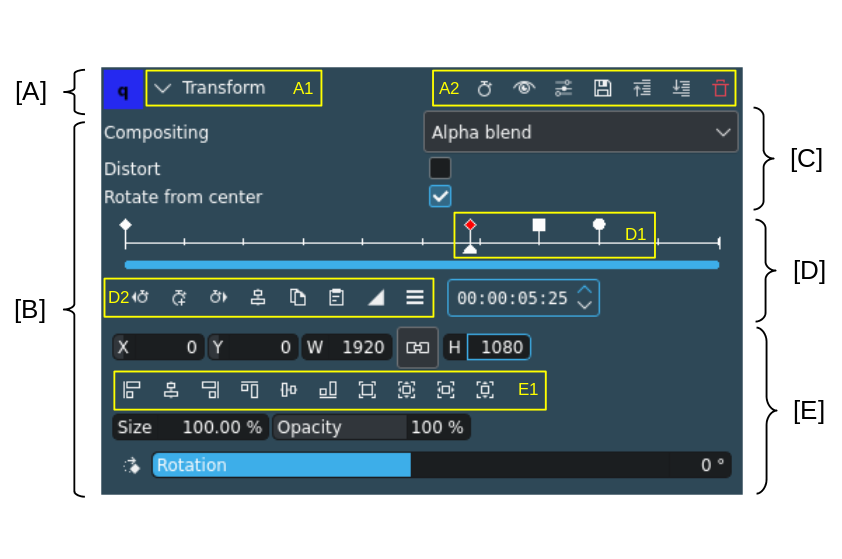
UI areas and elements (example using the effect panel)
Element |
Description |
|---|---|
[A] Effect panel header |
Contains the name of the effect and the collapse icon and the effect panel toolbar |
[B] Effect parameters |
Contains all the parameters for controlling the effect |
[C] Normal parameters |
Contains all parameters that are not keyframable |
[D] Keyframe panel |
Contains the time ruler, the keyframes and the keyframe action icons |
[E] Keyframable parameters |
Contains all parameters that can be keyframed[1] |
[A1] |
Name of the effect |
[A2] |
Effect toolbar (for icons see below) |
[D1] |
Keyframes; red color is selected; a diamond shape denotes a linear keyframe, a square a discreet and a circle a smooth keyframe. |
[D2] |
Keyframe action icons (for actions see below) |
[E1] |
Position and Size action icons (for actions see below) |
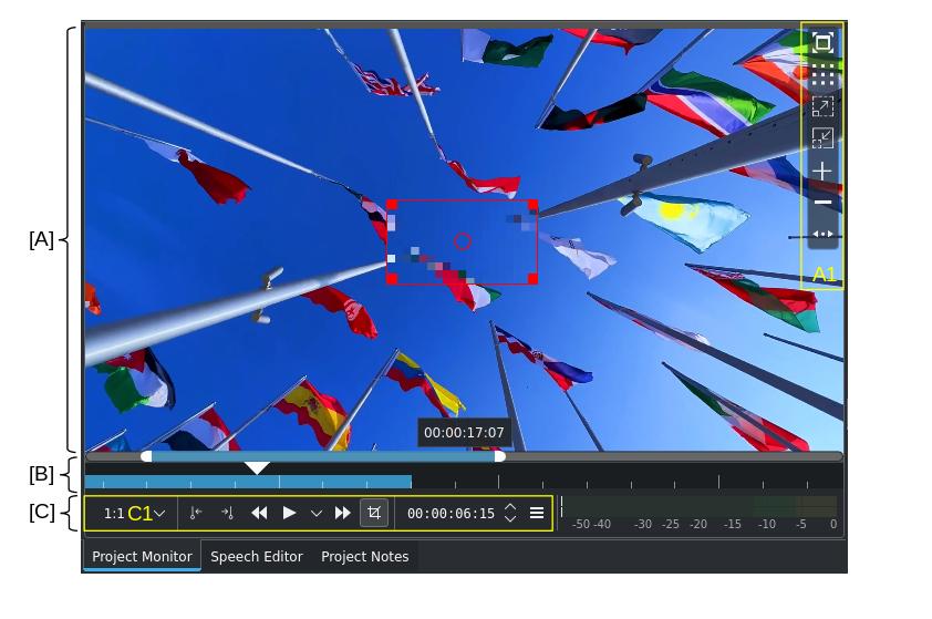
UI areas and elements (example using the monitor widget)
Element |
Description |
|---|---|
[A] Monitor area |
This is where the clip playback is shown and where effects can be changed (only in the project monitor, if possible with the effect, and Edit Mode is switched on) |
[B] Monitor time ruler |
Shows the timeline for the project or clip where the current frame is indicated by the playhead or caret. A zoom bar and/or a timeline zone is displayed here if set. |
[C] Monitor toolbar |
Contains controls/actions for the clip or project monitor widget |
[A1] Monitor overlay |
Monitor overlay selection panel (for icons see below) |
[C1] Monitor controls/actions |
For icons see below |
Icons and Buttons
Effect Panel Toolbar Icons
Icon |
Description |
|---|---|
|
Show keyframes in timeline on/off |
|
Enable/disable effect |
|
Open the advanced effect menu |
|
Save current settings as new defaults for this effect |
|
Move effect down one level. Changes the sequence effects are applied. |
|
Move effect up one level. Changes the sequence effects are applied. |
|
Delete effect from effect stack |


Keyframe Icons
Icon |
Description |
|---|---|
|
Jump to the previous keyframe |
|
Add a keyframe at the current position of the playhead/caret |
|
Jump to the next keyframe |
|
Remove the keyframe at the current position of the playhead/caret. If multiple keyframes are selected, all selected keyframes are deleted. |
|
Move selected keyframe to cursor/playhead/caret |
|
Copy selected keyframe(s) |
|
Paste keyframe(s) |
|
Keyframe is of type ‚linear‘ (interpolation towards this keyframe is linear) |
|
Keyframe is of type ‚discreet‘ (no interpolation between the previous and this keyframe) |
|
Keyframe is of type ‚smooth‘ (interpolation towards this keyframe is slightly dynamic with ease-in and ease-out with a little overshoot) |
|
Opens the keyframe options window |


Position and Size Icons
Icon |
Description |
|---|---|
|
Align the object frame to the left edge |
|
Center the object frame horizontally |
|
Align the object frame to the right edge |
|
Align the object frame to the top edge |
|
Center the object frame vertically |
|
Align the object frame to the bottom edge |
|
Zoom object frame to original size |
|
Zoom object frame to best fit the project dimensions and center it |
|
Zoom object frame to best fit the width of the project dimensions |
|
Zoom object frame to best fit the height of the project dimensions |


Project / Clip Monitor Icons
Icon |
Description |
|---|---|
|
[Clip Monitor only] Insert the zone into the project bin |
1:1 |
Set preview resolution |
|
|
|
Set the Outpoint at the current position of the playhead |
|
Play backwards |
|
Play; Play options |
|
Fast forward |
|
[Project Monitor only] Toggle Edit Mode |
|
Monitor options menu |
|
Switch full screen |
|
Change overlay. Click through the different available patterns. |
|
Zoom in |
|
Zoom out |
|
Add guide |
|
Remove guide |
|
Move toolbar. Click through to move the toolbar from the right (default) to the left and back. |


Timeline Icons
Icon |
Description |
|---|---|
|
Timeline settings |
|
Timeline zone on/off |
|
Select tool |
|
Razor tool |
|
Spacer tool |
|
|
|
|
|
Mix clips (same track transition) |
|
Insert clip zone in timeline |
|
Overwrite clip zone in timeline |
|
Extract timeline zone |
|
Lift timeline zone |
|
Favorite effects |
|
Start preview render |
|
Preview render options |
|
Audio mixer |
|
Edit subtitle tool |


Project Bin Icons
Icon |
Description |
|---|---|
|
Add clip or folder; open add source dialog |
|
Create folder |
|
Delete (selected) clip(s)/folder(s) |
|
Open Tags panel |
|
Filter; open filter selection |


Status Bar Icons
Icon |
Description |
|---|---|
|
Display color tags in the timeline |
|
Show video thumbnails |
|
Show audio thumbnails |
|
Show markers comments |
|
Snap |
|
Zoom to fit project |
|
Zoom out |
|
Zoom in |


