White Balance - An Important Tool
In photography (and hence in videos and images) lighting has a profound effect on the scene: from a warm orange of a candlelight to a cold blue in the shadows of a row of houses or in the mountains with a clear, blue sky. The human brain is capable of adjusting these color differences, and a white object is perceived as white even though the lighting gives it a different hue. In a sense, our brain performs an automatic white balance based on objects we know are white: a piece of white paper, porcelain or a bride’s white dress.
A photo or image will show a white or color-neutral object with a hue based on the color of the light source(s) and the ambient light, giving it, at times, a yellow, red, green or blueish tone. Of course, this does not look right and needs to be corrected. Ideally, the recording equipment has been set to the correct white balance before shooting the scene. Most cameras do a very good job of auto white balance when taking (single) pictures. When filming, however, no auto white balance is used. That is because even in constant lighting situations, the white balance automatically made by the camera fluctuates when the detail changes or the filmed person even moves his arm. This influences the camera’s assessment and leads to color changes which are very difficult to correct in post-production.
In case your equipment did not set the white balance correctly you can use the White Balance or White Balance (LMS) effects to eliminate any incorrect hues. In this tutorial we are using the White Balance (LMS) effect. LMS stands for long, medium and short and is a color space which represents the response of the three types of cones of the human eye, named for the responsiveness (sensitivity) peaks at long, medium, and short wavelengths.
White Balance (LMS space) effect
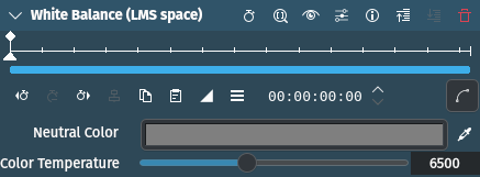
The color picker right next to the Neutral Color color panel can be used to select the color that is supposed to be white. Click on it and then select an area in the Project or Clip Monitor by dragging the color picker across. And that is all there is to it!
Of course, you need a neutral grey or white area in your source. If that is not the case you can use the Color Temperature slider for some adjustment.
The default value is 6,495. Values above that up to 15,000 make the image “cooler”/more blueish, values below up to 1,000 make it “warmer”/more amber or orange-y. The values are not true degrees Kelvin (K) but trend towards them.
The slider also fine adjusts any color selected with the color picker or the color panel for Neutral Color making the image appear warmer or cooler.
The White Balance effect works the same except that Color Temperature is called Green Tint which changes the source image from magenta (=0) to green (=10,000). There are cases where you may want to stack both effects and play with the sliders.