Text
Click on  , or use the keyboard shortcut Alt+T, then click in the main workspace to create a new text field with the default word Text in it. It is already selected, so you can start typing and overwrite it.
The text properties can be set in the Properties tab.
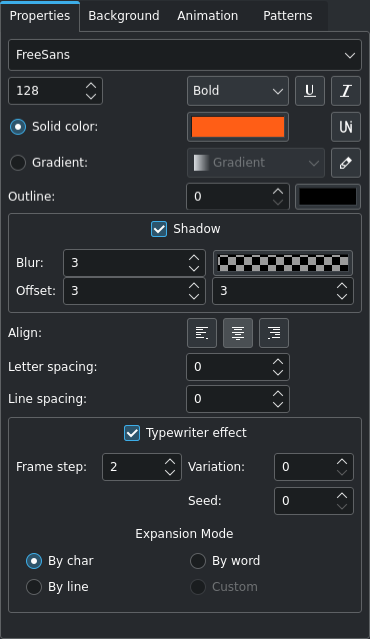
The text properties tab
Note: The width of the font drop-down list field is dynamically adjusted based on the longest name of your installed fonts. In case you do not see the down arrow for the font parameter, check whether there is a horizontal scroll bar at the bottom of the properties area.
- Font:
Select the font for the text. Kdenlive uses the installed fonts of your OS. If you need more fonts, install them first outside of Kdenlive using your OS's font installation method
- Font size:
Enter the desired size of the font directly or use the up and down arrows
- Font weight:
Select the weight of the font. Available weights depend on the installed font
- Underline:
 Select this to create an underlined text
- Italic:
 Select this to make the text italic
- Unicode:
 Clicking this icon opens a dialog window from which you can select special (unicode) characters that are not part of the normal keyboard layout.
- Solid Color:
Select this if you want the text to have one color
- Color Selection:
Click the color button to open the color selection dialog window
- Gradient:
Select this if you want the text to have a color gradient
- Gradient Selection:
Select from the available gradients
- Gradient Editor:
 Click on this icon to open a gradient editing window. Here you can create, edit, and delete gradients.
- Outline:
A value of zero (0) means no outline; higher values create an outline (measured in pixel).
- Outline color:
Click this color button to select the color for the outline
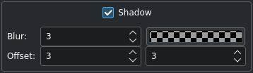
- Shadow:
Create a drop shadow around the text
- Blur:
Set the blur amount (default is 3)
- Shadow color:
Click the color button the select the color of the drop shadow
- Offset:
Enter the offset for the drop shadow in pixels for X and Y. Positive values create a drop shadow below and to the right of the text; negative values create the drop shadow above and to the left.
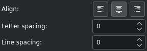
- Align:
Click the icon for left
 , centered
  , or right
  justified. If you select just parts of the text, the align applies only to the selected text; if the text box is selected, the align applies to entire text.
- Letter Spacing:
This controls the spacing in pixels between the characters. Negative values are possible.
- Line Spacing:
This controls the spacing between text lines. Negative values are possible.
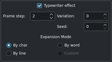
- Typewriter effect:
This special effect expands text character by character, word by word, or line by line.
- Frame step:
Determines how fast the next element will be displayed. The speed is constant over the duration of the title clip and effect period. Possible values are 1 - 240, default is 2.
- Variation:
Allows for introducing small fluctuations in the step length. Possible values are 0 - 20, default is 0.
- Seed:
The random generator for fluctuations is initialized with a constant seed value to assure a predictable pattern. The seed parameter changes the initial value of random generator. Possible values are 0 - 100, default is 0.
- Expansion mode:
Determines the way the elements of the text are displayed.
Object Zooming and Rotating
An object can be zoomed and rotated.
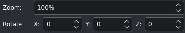
Sometimes zooming is easier than entering new values for W and H. Enter a zoom percentage in the Zoom field.
Rotating an object is possible by entering degrees of rotation into the Rotate X, Y, and Z fields. Note that the center of rotation is the top left corner of the object.
Object Stacking
The objects are placed on top of each other following the sequence in which they were created. If you need to bring an object/item forward that was created in the early stages, use the Z-Index field or click on the respective icon ( ,
,  ,
,  ,
,  ) in the stack toolbar. Likewise, you can also send an object/item backwards.
Object Alignment
Alignment to the project dimensions is possible using the icons in the toolbar:
 Align left or
  Align right moves the selected object towards the left or right edge stopping at the edges of each of the safety boxes with each click on the icon.
 Align top or
  Align bottom moves the selected object towards the top or bottom edge stopping at the edges of each of the safety boxes with each click on the icon.
 Align center horizontally or
  Align center vertically centers the selected object on the vertical or horizontal center axis of the outermost box.