The Vectorscope
The next scope (after the Histogram and the Waveform and RGB Parade) we want to discuss in more detail is the Vectorscope. This is actually the most interesting scope because it is quite different from the other ones and, secondly, is really useful for color grading.
How the Vectorscope Works
There is one simple thing that makes the Vectorscope so special: It uses a color space different than RGB. That sounds unspectacular but it is not. The previous scopes allow you to determine which brightness values exist in your image, the Vectorscope shows which colors there are.
The Vectorscope supports two different color spaces: YUV and YPbPr. Both of them have the Y in common, something you know from before: It is the Luma component (Rec.601 in both cases). This, amongst others, comes from black/white TV. When Color TV was introduced, some people actually recognized that not everybody would immediately trash his old b/w TV and buy a new one, so they still sent the b/w signal, but with two additional channels: The blue difference and the red difference (to Luma), called U and V. For more details look at the image with its individual YUV components on the Wikipedia page about YUV.
The other color space, YPbPr or its digital counterpart YCbCr respectively, are similar. If you switch between the two color models in the Vectorscope (via the context menu) you will notice that the colors are slightly shifted. YCbCr is used basically everywhere in digital video.
So, what the Vectorscope does: It calculates the Luma value of a pixel, then calculates the blue difference/red difference values. Then it throws the Luma value away. Why is that? It is because the Vectorscope is 2-dimensional. The blue difference is on the horizontal axis, the red difference is on the vertical axis. (There actually are three-dimensional vectorscopes which put the Luma component on the third axis!)
Example 1: Grayscale Video
Now let’s see at how this actually looks like in a video.
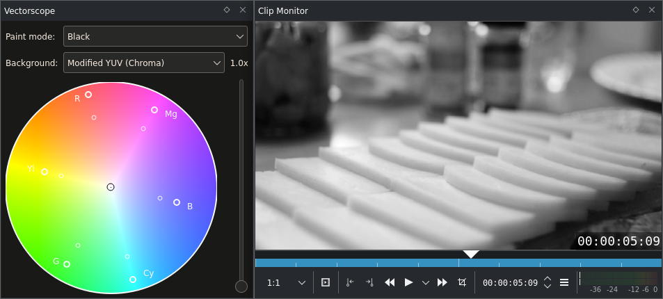
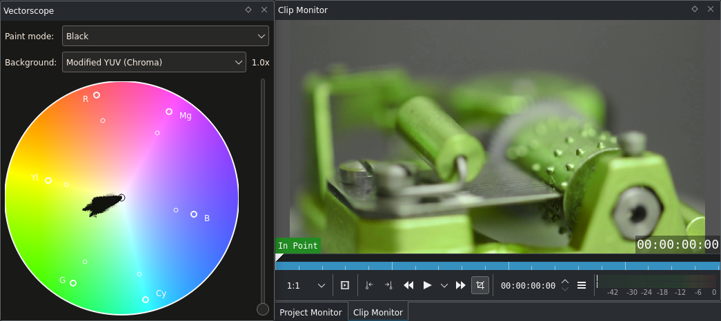
Vectorscope with a black-and-white image
Well … nothing? Close. There is a little pixel in the middle of the scope. And that is the whole image. That looks a little disappointing now, but actually it is great. All greys (plus black and white) are exactly in the middle. Everything that is not in the middle has some color information (and the further away it is from the middle, the higher its saturation aka. chrominance). This will come in very handy when it comes to white balance.
Example 2: Juggling Balls
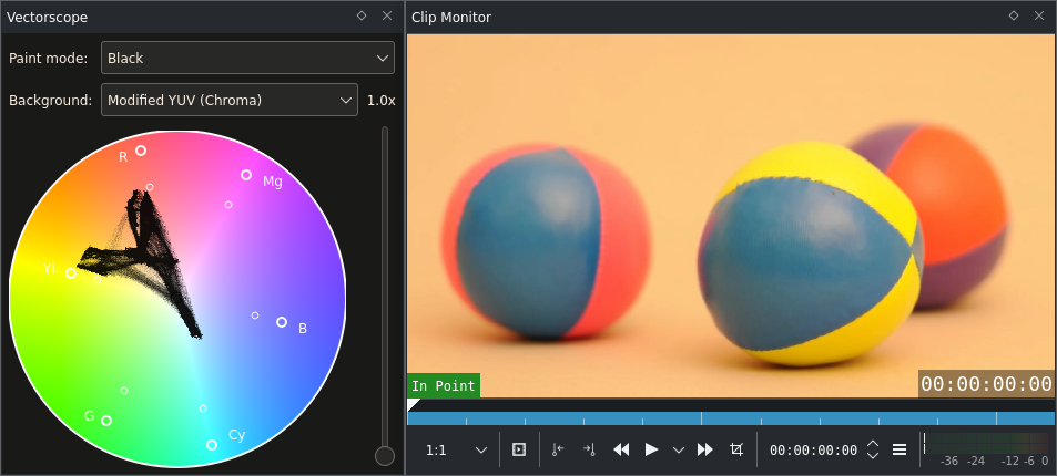
Vectorscope with a color image (juggling balls)
Juggling balls are more interesting, especially when they are colored. The ones above are. In this example a YUV background (with fixed Luma) has been switched in order to better identify the colors of pixel heaps on the scope.
Two things can be noticed:
there are six areas with high black density on the scope (which means that many pixels share this hue):
One that points towards blue (bottom right),
A big one around yellow,
Two big ones around red,
A smaller one between red and yellow,
And the last one which you might have missed, between red and blue.
These are exactly the ball’s colors! Blue comes from the two balls on the left, yellow from the yellow ball, the left red area is the pink part of the left ball, the right part in red is the red ball on the right. The part between red and yellow, which is actually orange, is the background of the whole scene, and the last one between red and blue is the violet part of the right red ball.
The orange background seems to connect all other areas. This is something really amazing. Like magic. It will help doing white balance. The neutral area will almost always seem to connect the other ones.
As the shot above is actually correctly white balanced, it should not be maltreated it here. But you should actually try! Download the sample below, add a SOP/Sat effect and change the Offset parameters for the RGB values. (Do not forget to enable auto-refresh.)
Now perhaps you wonder how we could be so sure assigning those spots to colors. Is it really the upper spot caused by the red ball? To find out, the red ball out was masked out using a white Color Clip. The spot then indeed disappeared.
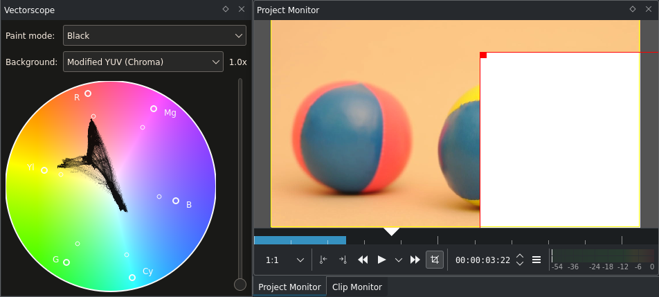
Vectorscope with a partly covered (masked) color image
The violet spot has disappeared as well, and also big parts of the yellow spot because the white rectangle covers a large part of the yellow ball as well.
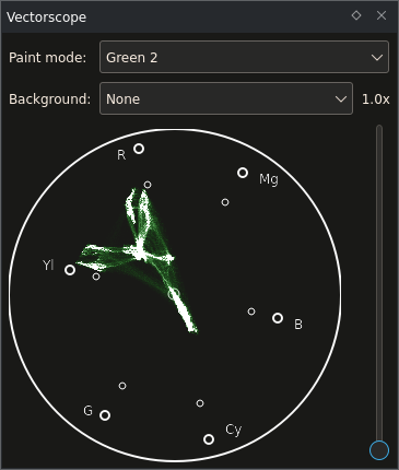
Example 3: Musical Box
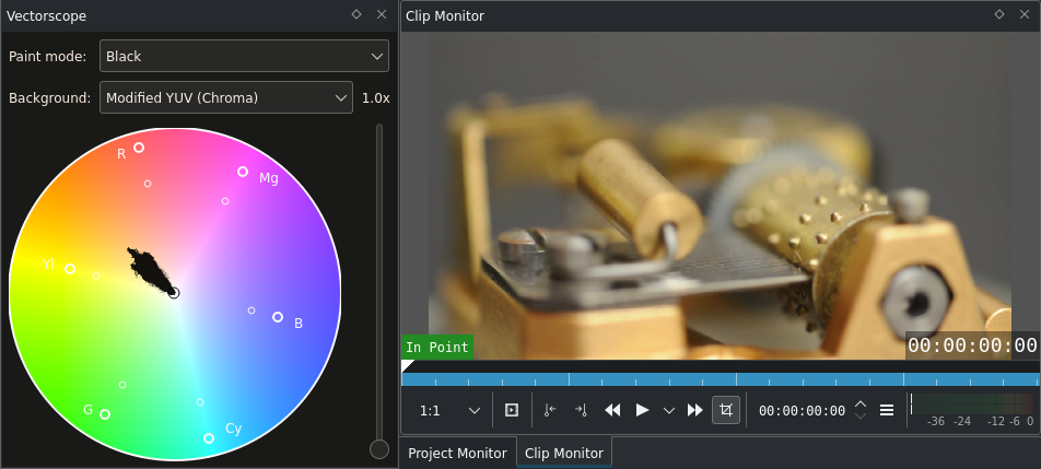
Vectorscope of an image of a musical box
Again, two things worth pointing out for this clip:
This shot of a Swiss Musical Box mainly consists of orange tones, all points on the vectorscope lie between neutral (center) and orange. Not too saturated orange tones presumably coming from the bronze/messing parts.
The white balance seems to be correct. The Vectorscope indicates that there are neutral pixels (i.e. greys), and they seem to be the origin for the other colors.
But when increasing the gain (or zoom level) of the Vectorscope to 5x we see that the scope image actually stops right before neutral.
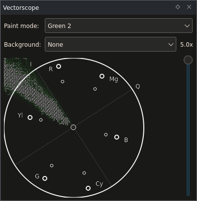
Vectorscope before white balancing
If you open this clip and take a look at the Waveform you will notice that it shows the same: Blue is too low, red is too high. To correct this minor color cast we can use the SOP/Sat effect again, adjusting the Offset values. By doing that the points on the Vectorscope will be shifted around. A positive red offset will make the points shift towards red at the top, a negative offset shifts them towards the opposite direction (that is, towards the complementary color of red, cyan).
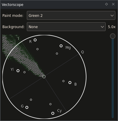
Vectorscope after white balancing
Here, the blue and red values were adjusted such that there is some padding around the neutral center. It is usually not enough to just let the first pixel hit the neutral point because of several factors like the material of the neutral object itself, chromatic aberration (also see this more accurate article about chromatic aberration) in lenses, and artifacts in the recorded video file. So usually neutral areas will not share one single pixel in the vectorscope but have a certain diameter. Hence the padding.
Because this is a suitable clip for hue and the Hue Shift effect:
Vectorscope of the musical box after applying the Hue Shift effect (Hue=45)
Now what happened here? The hue has changed, and the points on the scope look like rotated by 30 degrees. And indeed they did rotate. The Hue Shift effect changes the hue of all colors by a certain (configurable) amount. In the Vectorscope this becomes visible as a rotation around the center of the scope.
Similarly, when changing the saturation/chroma, the dots on the vectorscope will move closer to the center or further away from it.
Creating a Look for Your Video
In the Histogram chapter we mentioned creating looks with color correction or Color Grading. This example covers part of the tip of the iceberg of this topic.
What is special about creating a look for a video? Let’s take a look at some random clips:
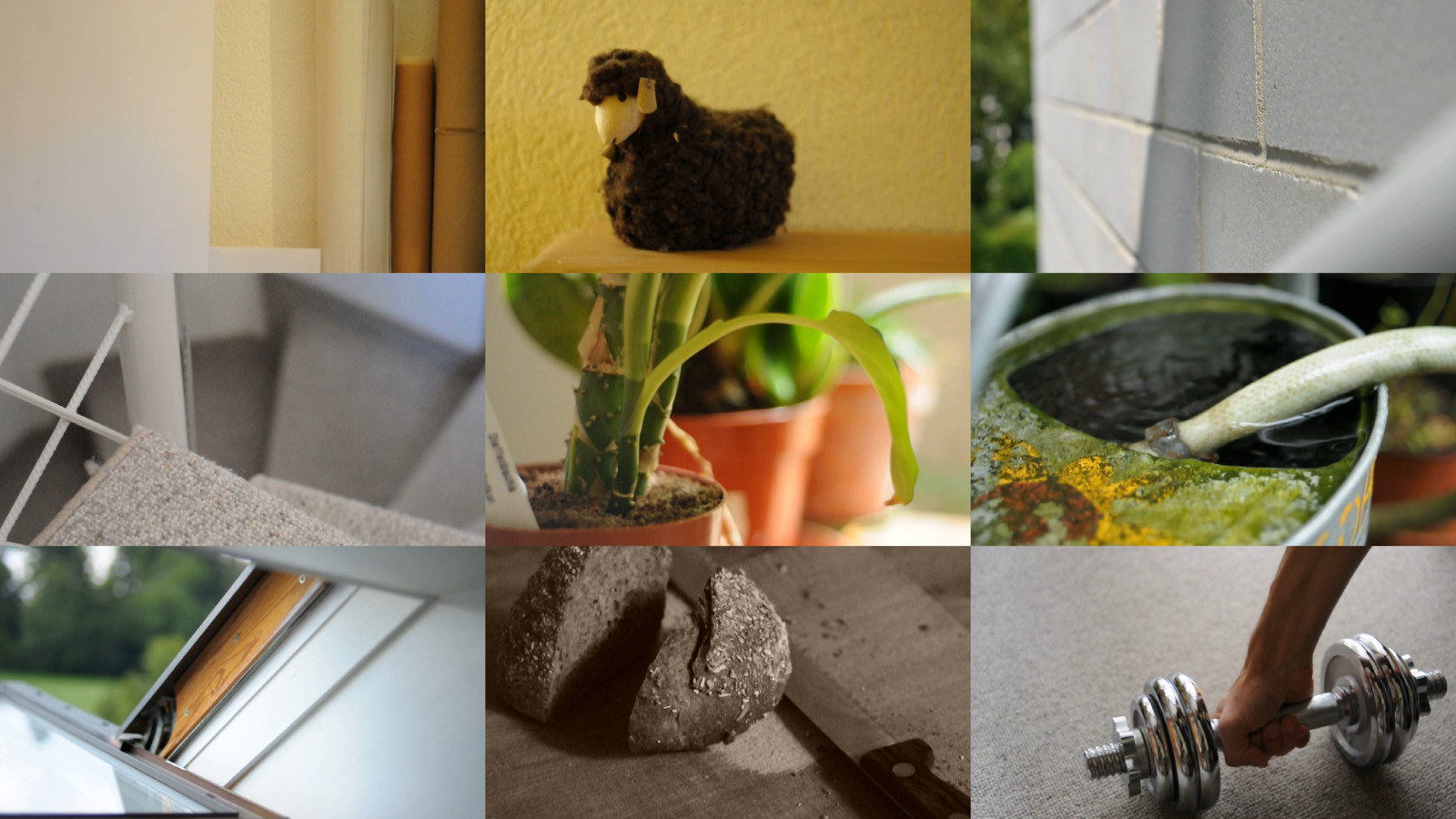
Collection of not color-graded video stills
Mostly different content and therefore different colors - as said: random. One point of Color Grading is to give single clips a connection. This is not limited to white balance only. White balancing a clip is about removing color casts (which is a good thing because it gives you a neutral starting point). But we can also add new colors.
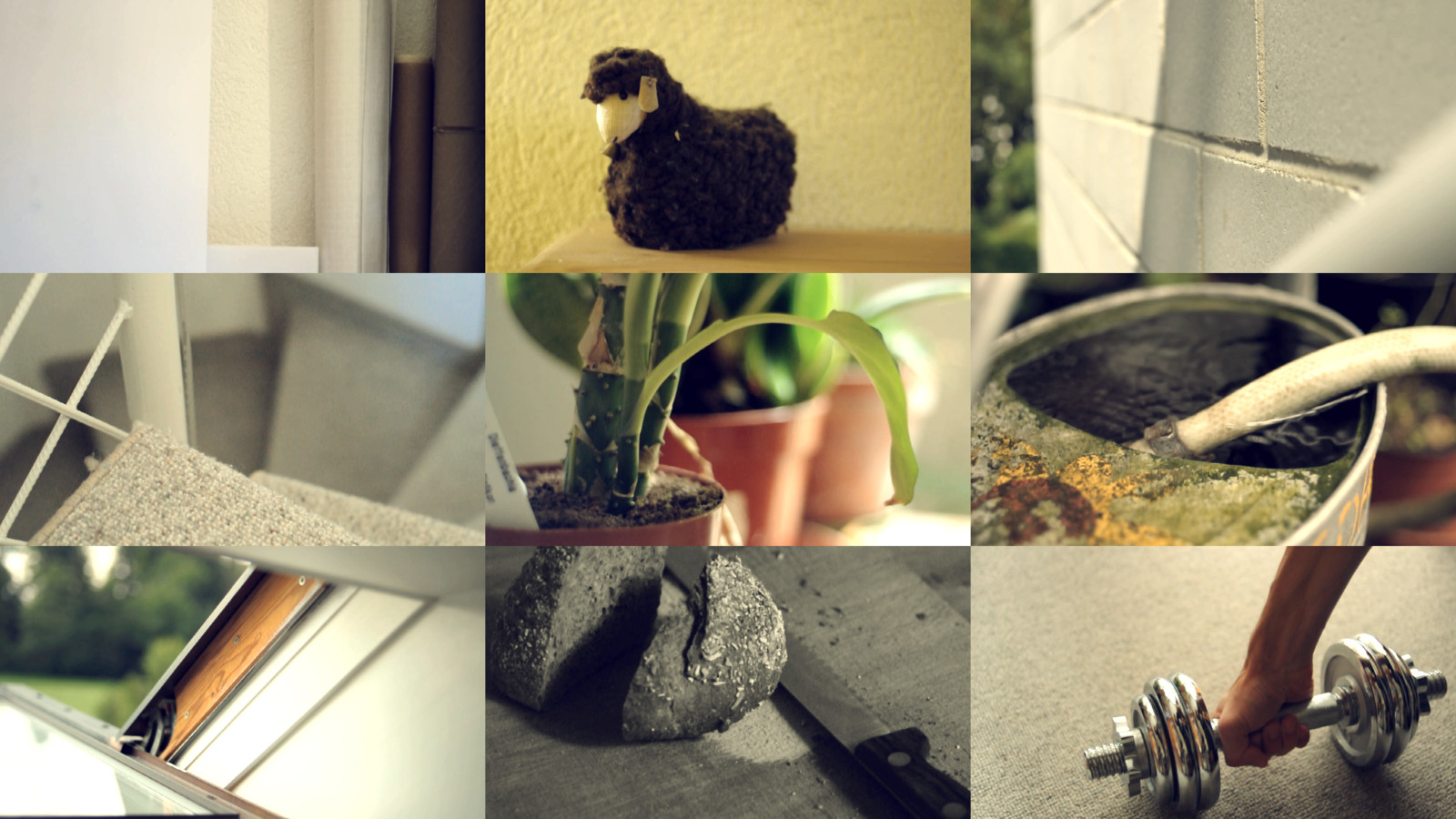
Collection of color-graded video stills
These clips look much more like if they belonged together. This is the result of Primary Color Correction (Primary means that it affects the whole image; Secondary Color Correction would only affect parts of it, e.g. by using masks, choosing color ranges, etc.): White balance (plus in some cases reduction of saturation) followed by a SOP/Sat effect. The latter SOP/Sat effect does something similar as the Blockbuster Effect: here the blacks become blueish, the mids and the whites tend towards yellow.
See also this page for some hints about looks and the vectorscope.
Vectorscope Options
You can adjust the Vectorscope as follows by right-clicking it:
Export Background - Exports a color plane of the desired color space. It allows to export RGB, YUV and YCbCr planes (like the ones you see when visiting the Wikipedia articles about these color spaces).
75% Box - Marks the position where color saturation reaches 75% of its maximum value. This may be interesting if you work for broadcast. Colors exceeding this box were not regarded as broadcast safe - but before changing the saturation to a max of 75% better consult your broadcast company.
Draw axis - Draws the U/Pb (horizontal) and V/Cr (vertical) axis.
YUV and YPbPr - Switches between the two color spaces YUV and YPbPr.
Summary
The Vectorscope shows the hue and saturation distribution in a way we can understand without problems. This is useful for quickly recognizing color casts, but also helps judging the color distribution of a clip and match it to others.
All scopes together fulfill another important task: They help matching video from different light situations and different input sources (like a second camera) regarding brightness and color. This is what you need test charts for. Different cameras might have a different dynamic range and different colors. So when combining these shots you first shoot a test chart and then match exposure and color.
Notes
- Sources
raclette-greyscale.avi(720/24p, 12 MB)juggling-balls.avi(720/24p, 11 MB)Musical-box.avi(720/24p, 23 MB. Video from Nikon D90, Audio from Zoom H4n.)
The original text was submitted by Simon A. Eugster (Granjow) on Sun, 10/10/2010 - 18:30 to the now defunct kdenlive.org blog. For this documentation it has been lifted from web.archive.org, updated and adapted to match the overall style.